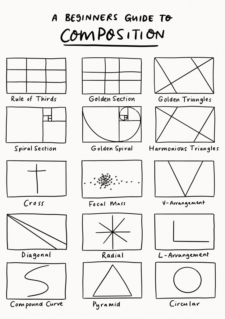
Packative Editor Guide Pt. 3: A Deep Dive into the Basics of Design Principles
Do you want a more eye-catching design that goes beyond just a logo or polygon? But are you worried it might look messy or outdated? Then it’s time to study design a little more. If you haven’t checked out Part 1 yet: Editor Guide Pt. 1 If you haven’t checked out Part 2 yet: Editor Guide Pt. 2...

Do you want a more eye-catching design that goes beyond just a logo or polygon? But are you worried it might look messy or outdated? Then it’s time to study design a little more.
If you haven’t checked out Part 1 yet: Editor Guide Pt. 1
If you haven’t checked out Part 2 yet: Editor Guide Pt. 2
Composition: the Basics of Design
When designing, you might think that having a beautiful image is the most important thing. In fact, the arrangement of other elements is the most important factor in creating a visually pleasing design. The key elements when setting up composition are as follows.
1. Proportion: Dividing the Artboard
You need to check how a single screen is divided and how much space each different element occupies. This is also one of the most important parts of composition in design.
2. Emphasis: Focusing on Brand Identity
This is about which part catches the viewer’s attention the most. Use balance and contrast between elements to create standout design features, and direct the eye to what is “important.”
3. Balance and Unity: Between Stability and Energy
Do the design elements work well together? A symmetrical composition gives a calm, stable feeling! But balance is not the only answer—an asymmetrical layout can feel more dynamic and lively.
4. Rhythm: The Dynamism of a 2D Pattern
Depending on changes in curves, straight lines, and the size of design elements, even a static image can feel rhythmic. Structural changes in a pattern make it more engaging and help viewers focus. Choose a box you like and give packaging design a try!
5. Pattern and Repetition: A Unifying Element in Packaging Design
What happens when one element appears repeatedly within a design composition? Repetition creates a clear structure in the image and has the power to bring multiple design elements together as a single pattern.
6. Contrast: Differentiating Between Products
How do different elements work within your design? Why not emphasize their differences through contrast? Create contrast with hues, tones, sizes, and more to bring energy into the design!
If you want more packaging color tips, check out: Packaging Design Color Guide
Still confused?
Then try using a composition that has already been proven by countless designers!
Once you’ve finished learning the theory behind packaging design, put it into practice right away here!
How to Use Composition
The tea brand packaging for Yun Shan Tea was designed using the Harmonious Triangle composition!
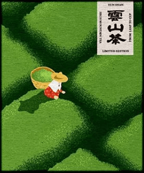
It also uses a green tone that clearly suggests tea, helping indicate what’s inside the package, and a red color that contrasts with the green to make the small farmer character stand out.
 Source: Cyan triangle, Moroccantea
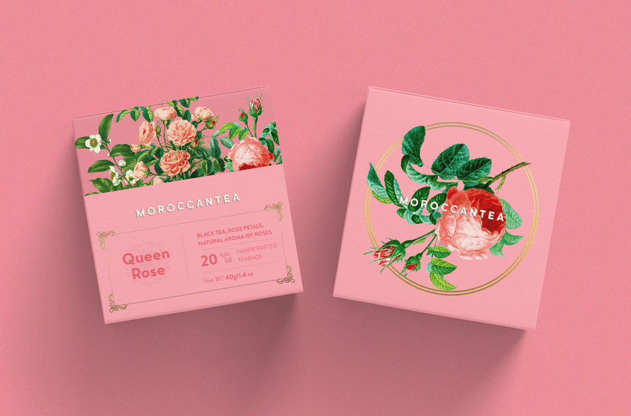
In the case of Moroccan Tea, a circular composition was used to focus attention on the “rose” image. By centering the key element for emphasis and adding green leaves to the pink palette, the design feels lively and the packaging becomes both beautiful and clear.
As you can see, the design principles mentioned above are widely used to make packaging clearer and more attractive. When designing your own packaging, use these basic design theories to create something even more beautiful!
Start designing beautiful packaging right away with the Packative Editor!