The Star of Packaging Design: How to Use Typography Properly
Typography refers to the arrangement of typefaces and the work of organizing and presenting letterforms in print and editorial design. Typography on boxes: In package design, typography is an important communication tool that delivers the message a brand wants to market to consumers, and it is also often the first information consumers decode from a product package. Because people read the text, separate information, identify brand keywords, and form an impression of the brand image...

Typography (Typography)
Typography is the arrangement of typefaces, and it refers to the work of structuring and presenting letterforms in print, editorial design, and related fields.
Typography on Boxes:
In package design, typography is an important communication tool that delivers the message a brand wants to market to consumers, and it is also often the first information consumers decode from a product package. Because people read the text, separate information, identify brand keywords, and form an impression of the brand image.
So when handling typography in packaging, you should first and foremost think about how effective it is at conveying information, and then develop the design from there.
Take a closer look at key elements of package design: Package Design Beginner's Guide
The Effects of Typography in Package Design:
Organizing the information inside package design—such as the brand name, product name, and ingredients—so that it can be understood at a glance is one of a designer's most important tasks. Since text inside the box is one of the most frequently used elements in package design, establishing typographic hierarchy is one of the designer's most essential responsibilities.
A must-read if you're considering packaging production! Packative introduces custom folding cartons.
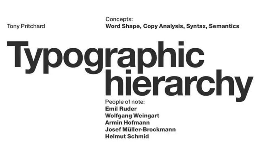
Typographic Hierarchy:
The visual hierarchy of typography is what helps viewers determine which information they should focus on. Without a properly organized visual order, your main message can easily get lost.
Elements That Determine Visual Hierarchy in Package Typography:
The elements that define typographic hierarchy are not simply the order in which text appears. Let's look at the various factors that determine hierarchy:

Typography's Position and Layout
Where you place the content you want to stand out—such as the arrangement of the title and body text—plays a very important role in hierarchy. For example, text placed in the center is usually the most prominent. Or, placing text in a way that breaks from the standard layout can also make it stand out. Try experimenting with where text is positioned to create visual hierarchy!
If you want to try package design yourself: Experience the box production process at Packative
Font Size
The size of letters is one of the easiest elements to use when creating different levels of emphasis between pieces of information. It is also one of the quickest things to change and notice.
The rule for emphasis is simple: bigger means more important, and smaller means less important. However, keep in mind that different typefaces can feel different even at the same size, and when combined with other elements, you may need to adjust size accordingly based on multiple factors.
Feel free to use the Packative Editor at no cost and create your own package design here!
Font Weight
Making typefaces bolder or lighter is the second easiest way to create hierarchy between text elements. If you use a bold font, it feels more important; if you use a thin font, it naturally reads as more detailed information.

Text Color
Color is often an overlooked factor in building typographic hierarchy, but in fact it is a very effective design element for differentiating importance. Simply adjusting the value within the same color family can create a sense of priority, and contrast with the background color can also change the visual hierarchy of text.
Learn more in the package design color guide in more detail
Contrast
Along with contrasting colors, contrast in text size, differences in weight, and differences in typeface all contribute to typographic hierarchy. Just as a 1–2 pt difference in font size does not create enough impact to clearly separate text levels, strong contrast is necessary across all elements. So when designing typographic hierarchy, you should separate titles and subtext using a variety of clearly distinguishable factors such as font size, weight, and typeface.
If you're 고민 about packaging production, be sure to read: Everything You Need for Box Production
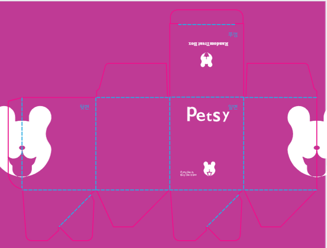
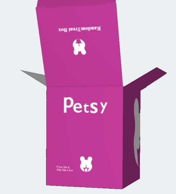
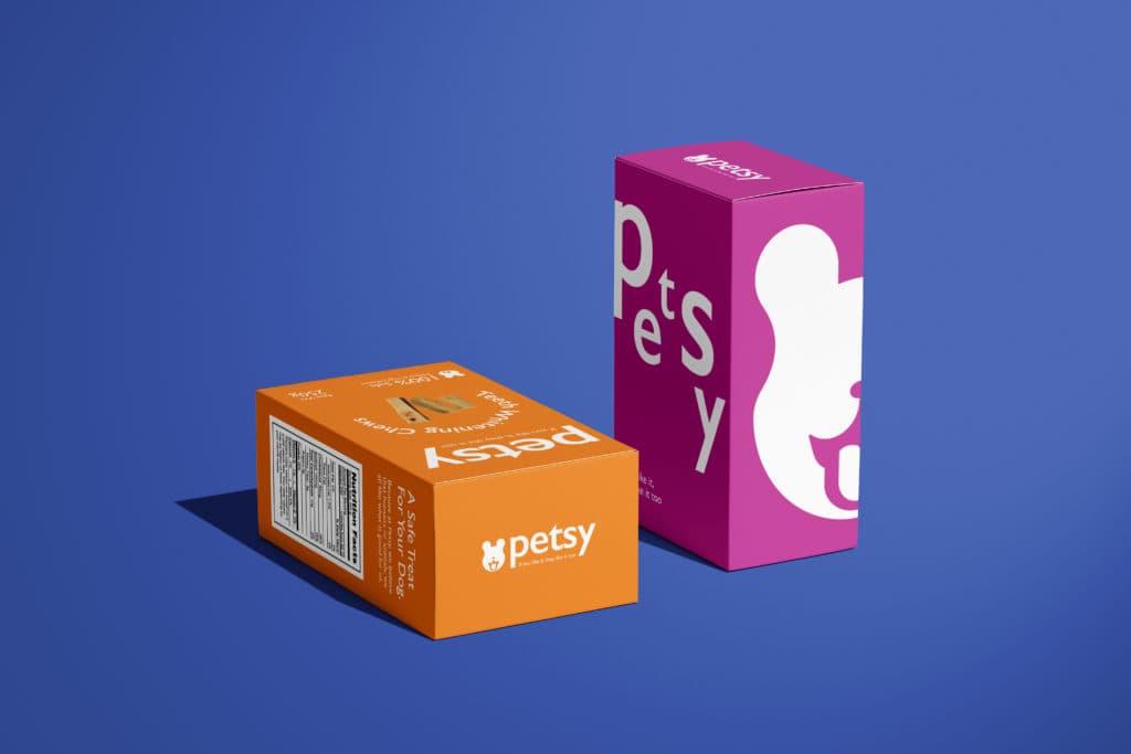 White stands out well against dark backgrounds such as purple
Uppercase / Lowercase
When using English, the difference in feeling between uppercase and lowercase letters also plays a major role in determining text importance. Of course, writing everything in uppercase is not easy to read, but it is a good idea to capitalize important parts such as product names or brand names to create distinction.
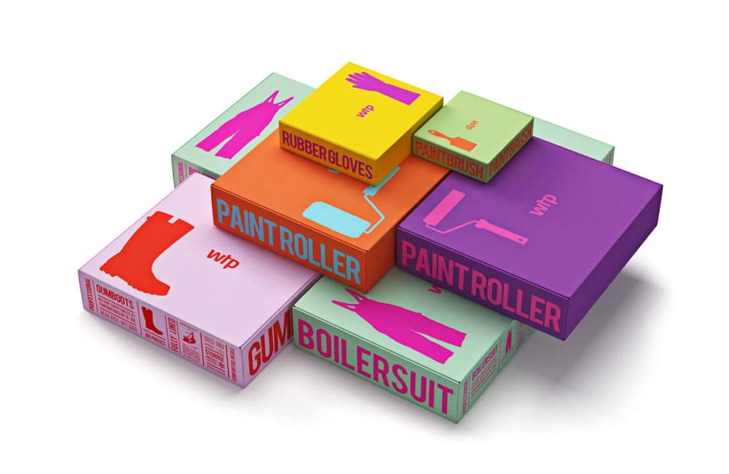 Source: Reynolds & Reyner, Waldo Trommler Paints
Organizing Package Design Through Visual Typographic Hierarchy
The first thing to consider before starting a design is how many levels of hierarchy the design will have. By default, every design is divided into a title, subtitle, and other items, and the designer can add extra levels depending on the brand and product.
For example, for a perfume brand, the title might be the product name, the subtitle the brand name, and the other items the volume and scent. If the brand name is the main thing you want consumers to remember, then the brand name may become the title. In any case, hierarchy is defined according to the most important information.
Once you've decided how many hierarchy levels you need, the next step is to create distinctions between each level. Naturally, the title should stand out the most, and the remaining separation should be based on importance.
Reference if you're producing packaging design: A Guide for Box Production Beginners
Font Size for Logos, Ingredient Labels, Product Names, and More

When it is difficult to create differences in font size during design work, designers often use the classic typographic sizes found in The Elements of Typographic Style. The most commonly used sizes are 6, 7, 8, 9, 10, 11, 12, 14, 16, 18, 21, 24, 30, 36, 48, 60, and 72 pt.
Designers usually start with a base font size of 12 pt for body details, and then increase it to 14, 16, 24, and so on depending on whether they want more readability. Or they may use smaller text to minimize minor details. However, printing below 7 pt may make text unreadable depending on factors such as ink spreading, so we recommend using 7–8 pt or larger.
A must-read if you're considering packaging production: Top 10 Logo Creation Tools in 2021
Irregularity: Are Font Size Rules Everything?
Before setting the actual size ratio, you need to adjust the scale by considering the text size of other fonts. Since different fonts have different default sizes, even if you use the same numeric pt size, the actual letter size may feel uneven and unbalanced.
Also, keep in mind that traditional typographic proportions are only guidelines for designers, not rules that must be followed. Depending on font weight and design style, it's perfectly fine to forget conventional standards and create a new composition!
Try using typography in the Packative Editor
Choosing Fonts That Work Well With the Package
One of the biggest distinctions between a “professional design” and an amateur one is the typeface, or font. It is genuinely difficult to find fonts that match the product inside the package and the image of the brand while also remaining readable and easy to understand. Choosing and arranging different typefaces so that they complement one another is half instinct and half theory, so if you're not confident in making the choice yourself, following basic guidelines for typographic pairing is a good approach.
A helpful article for packaging design: Vector Images vs. Pixel Images: Why Should Your Package Design Be Created as a Vector File?
Serif and Sans Serif Fonts
First of all, mixing serif and sans serif fonts will likely be much more convenient than combining two different serif fonts or two different sans serif fonts. Of course, that does not mean you should mix any serif with any sans serif!
Not sure what serif and sans serif fonts are?

Simply put, serif typefaces have small projecting strokes at the ends of letters, while sans serif typefaces are clean letters without those strokes. Because of their projecting forms, serif typefaces make horizontal eye movement easier, and their stroke widths are not overly heavy, giving them a classic look that feels natural and comfortable.
Serif typefaces are often used for print because they are highly readable, making them especially suitable for packaging. Sans serif typefaces, on the other hand, have stroke widths that remain consistent and generally maintain similar horizontal and vertical stroke thicknesses, giving them a strong and direct impression. They are also highly legible, which is why they are often used on screens, as well as for titles and signage.
If you balance emphasis and readability by appropriately combining serif and sans serif typefaces, you can create a much more polished package design.
A must-read if you're considering packaging production: 7 Things to Check Before Box Production at Packative
Serif vs. Sans Serif: Which Makes a Better Title?

Wondering which should be the main font between serif and sans serif? Use the purpose of the design that the typeface will be used in—things like the brand context and the product itself. For example, if the design needs to feel lively and cheerful, the font should also feel playful and light. If the design is more serious and modern, the typeface should have a firmer mood as well. In other words, the mood of the design must be reflected in the typeface.
Check out a variety of package designs: Macaron Packaging
Also, when matching typefaces, consider contrast as well. Rather than using bold type for all text or using only thin typefaces, combining fonts with different weights is more effective for balancing the overall design.
How to Balance Typography
Another way to balance typography is to use typefaces with similar x-heights. X-height is a term used in typography that refers to the distance between the baseline, which is the alignment line at the bottom of each letter in Roman typefaces, and the mean line, which is the virtual line that marks the average top height of lowercase letters. Matching x-heights helps prevent clashes between typefaces, and in addition to x-height, similarity in kerning (spacing between letters) and letterform shape also helps different fonts work well together. For example, round typefaces and square typefaces do not always pair well.

Spacing between letters also helps create typographic hierarchy. The more widely spaced the letters are, the more noticeable the sentence becomes. Increasing letter spacing is especially effective when the alphabet is set in uppercase. However, keep in mind that overusing it can make the design look amateurish.
These basic guidelines can help you build font combinations, but nothing is better than experimenting for yourself and trying combinations in real projects. Keep testing and refining until you create the best type pairing!
Font Pairing Order:
- Choose an anchor font for the main text
- Select a few secondary fonts for the combination candidates
- Compare each pairing to see which ones you prefer
- Decide on the final font combination
Closing Thoughts
Now we’ve finished introducing the essential basics of package design typography!
Font size, letter spacing, text color, uppercase and lowercase usage, and typeface choices all work together to create typographic hierarchy and control the visual balance of a design. Through these detailed adjustments, you can create packaging that effectively delivers the message your brand wants to convey.
But in the end, the best way to find the right combination is to try many different approaches yourself, observe different levels of visual weight, and discover the optimal design you personally like best!